- March 10, 2025
- A focused look at three examples of visualizing the death toll from COVID as an illustration of how to inject empathy into data visualizations.
It’s been over a decade since I’ve been in data journalism, but what of my enduring interests is how data visualizations can remind readers of the human beings that underlie most statistics and time-series - or as I call it, connecting with the dots. As we enter the five-year anniversary of the COVID-19 pandemic, I wanted to write a short piece looking at three different examples of media organizations have presented the severe loss of life, to show some of these concepts in practice.
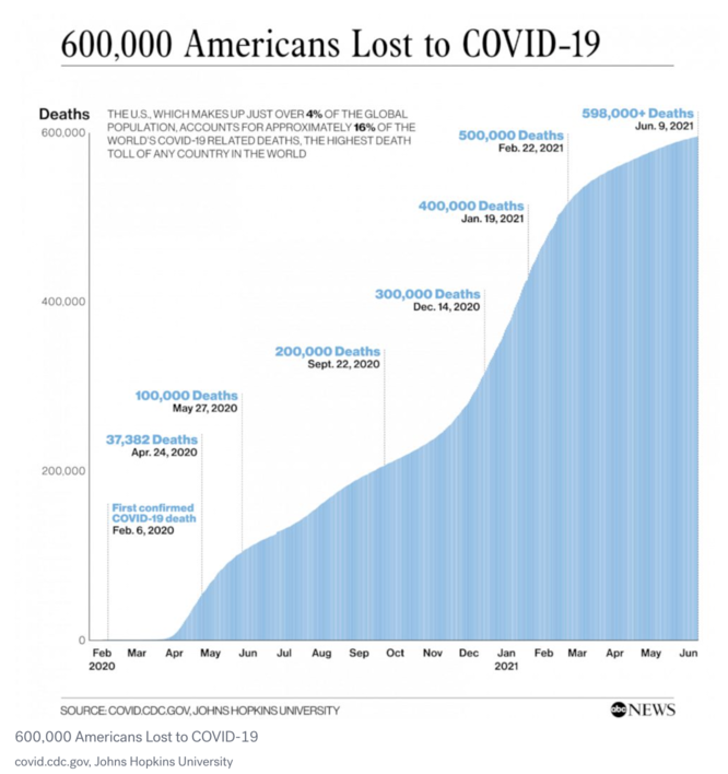 For the first example, here is a straightforward chart that was published on ABC News when the US hit the grim milestone of 600,00 dead. This is a perfectly acceptable chart for the topic. It shows the increase of deaths over time as an expanding area, highlights specific points on the timeline where grim milestones were reached and shares the context that the US has a disproportinately large number of deaths relative to the size of its population. And yet… I think it struggles with the issue that hits every graphic of this type. At a certain point, the human mind just stops being able to visualize a large number of people anymore. In Zbigniew Herbert’s poem Mr. Cogito Reads the Newspaper, the eponymous narrator contrasts a newspaper’s grisly detailed reports of a quadruple homicide vs. a news item of 120 dead soldiers in a war, for whom
for 120 dead
you search on a map in vain
too great a distance
covers them like a jungle
they don't speak to the imagination
there are too many of them
the numeral zero at the end
changes them into an abstraction
a subject for meditation:
the arithmetic of compassion
And that’s the challenge here. No matter how clear and direct the chart wants to be, it’s easy for the reader to just view the loss as an abstraction, through a largely analytical lens. From too far away, it’s hard to feel connected.
One alternative is to zoom in to the near and show the specific people affected in detail. Newspapers will often do this by pairing a graphic showing large-scale trends with an article describing the case of a person who was affected. But what if a graphic itself provided the near view. This one from New York Times at the milestone of 100,000 dead (only 1/6th of the toll in the graphic above) tries that approach using another technique as well I call “wee people”:
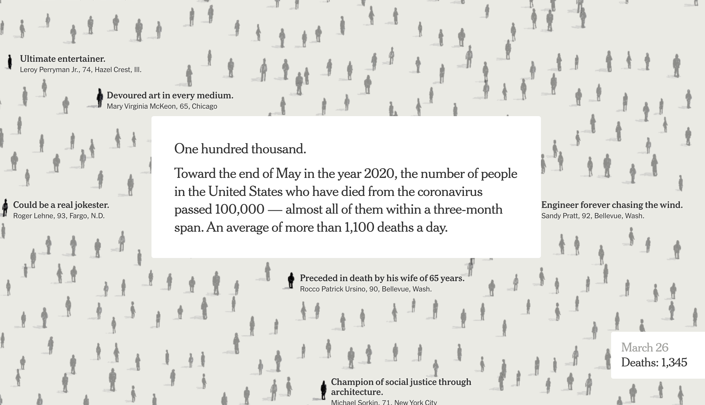
In this visualization, the reader is invited to scroll and scroll and see how the deaths cluster and the details for individuals pop up. The idea is to grab the reader and make them see the individuals that make up this number. This required a large effort to assemble, with researchers looking through resumes and editors selecting specific details they wanted to highlight and graphics editors to code the treatment online and in the newspaper, but the result is to humanize what was an unimaginable total. It encourages the reader to pause and notice what has been lost by sharing a fragment of these lives.
Sometimes, it’s necessary to grab the reader by the lapels.
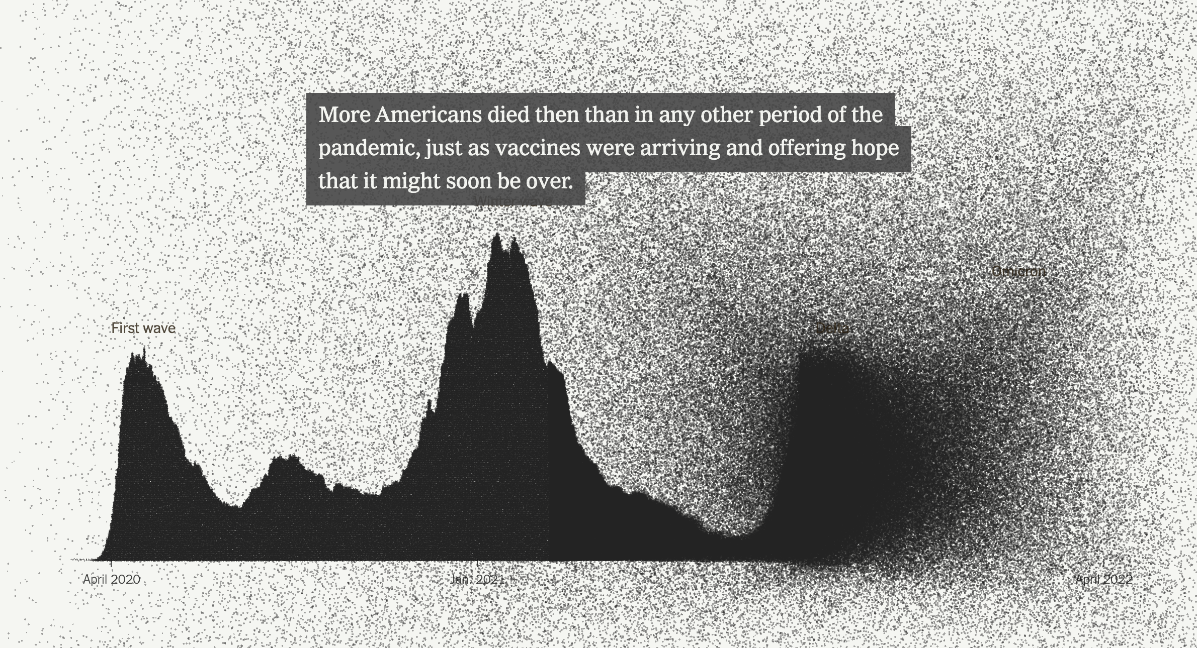 I’d like to highlight one other piece from the NYT. At the impossible-to-comprehend mark of 1 million dead in the US, the New York Times ran an online graphic with a similar scrolling nature, but it involved millions of black dots coalescing on the screen and reassembling into charts and visualizations to show the impact. At this scale, it would be impossible to read the obituaries of all who died in a similar way the Times did for 100,000; instead, the paper selected a few interviews with survivors to focus on specific demographics like the elderly who were especially harmed. And, for the print edition, the Times chose to make the point as directly as possible.
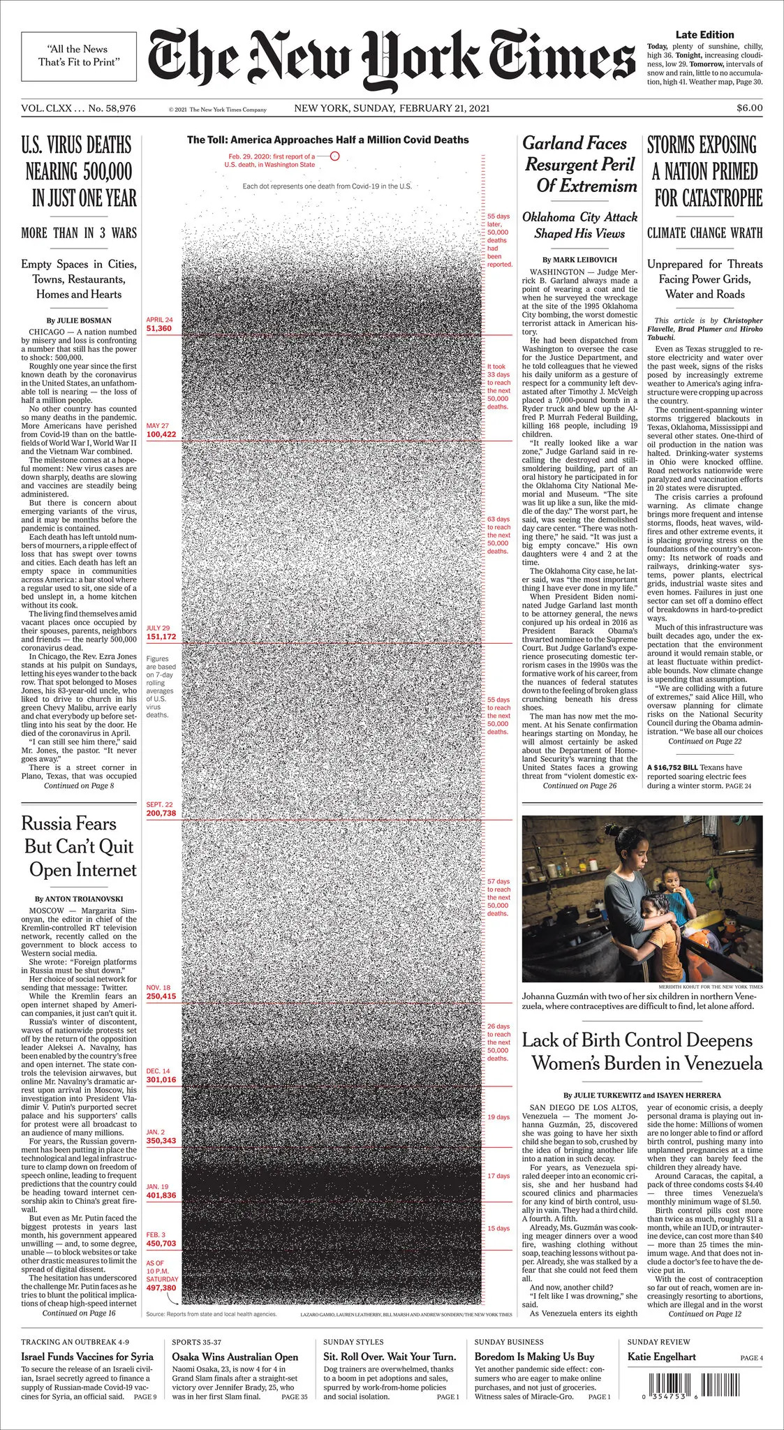
At the bottom, the dots become so dense that it becomes impossible to tell if there is some pattern to the data causing the banding or the printing process is breaking down, in a similar way as the tape did on the The Disintegration Loops. This graphic is full of abstraction, but the reader is not allowed any distance.